
Practical CSS Guide for Busy Developers
Why waste time memorizing stuff you will never use? Here's the only CSS guide you will ever need to start styling web pages.


If you're like me and prefer to learn by starting to build first and googling when you get stuck, this CSS guide is for you.
It will give you a crash course in only the CSS you absolutely need in practice, wasting no time on stuff you can google once you need it.
Give me 5 minutes of your time and you will be on your way to building your app.
What is CSS?
CSS stands for Cascading Style Sheets - it's a language used to add styles to web pages by describing how elements should be displayed.
Elements are styled using CSS by selecting them with selectors and setting values for their properties:
p {
  background-color: green;
}
In the above example, all <p> elements will be selected and given a green background color.
CSS Selectors
There are three primary types of selectors:
element - any HTML tag
p,div,h1, etc.class - string in
classattribute prefixed with a dot, e.g.<div class="section">can be selected with.sectionid - string in
idattribute prefixed with a hashtag, e.g.<div id="nav-bar">can be selected with#nav-bar
I recommend primarily using classes to style your elements because elements can have more than one class, making it easy to extend or override styles.
There are three ways to combine selectors:
comma - to select all elements matching any of the comma-separated selectors and apply the same style.
space - to select a nested element, by describing its path. For instance
.section h1will select ah1element that's a child of an element with classsection.nothing - appending more class selectors to an existing selector will increase its specificity, e.g.
h1.titlewill select<h1>elements withclass="title".
Cascading
You can combine and override styles by using selectors with higher specificity. A simple way to make the selector more specific is to give it more classes.
.text {
  color: #cccccc;
  font-size: 14px;
}

p.text.small-text {
  font-size: 12px;
}
In this example, all elements with class="text" will have a gray color and 14px text size. The <p> elements with class="text small-text" will have the same gray color, but their text size will be 12px instead because of the more specific selector that overrides the font-size property.
In practice, I recommend keeping selectors as simple as possible, such as using only a single class and not cascading the styles too much.
Adding CSS styles
There are two ways to add styles to your elements:
style attribute - HTML elements can have a
styleattribute, where you can directly write CSS expressions that will be applied to the element, for example:<div style="color: white; background-color: black;">stylesheets - declared either between the
<style>tags as a child of the<head>element in your HTML code, or as a separate.cssfile.
Stylesheets
If you create a .css file containing your CSS code, you can import it in HTML using the <link> tag with rel="stylesheet" attribute:
<head>
  <link rel="stylesheet" href="styles.css">
</head>
If you're using something like React with a bundler like Webpack, Vite or similar, you can import the CSS file using the ES6 syntax in your JavaScript files:
import './styles.css'
The only CSS rules to start with
CSS has over 500 different properties. It would be stupid to try and memorize them all. There are only around 20 rules that I most often use in practice.
These rules will get you started building without overwhelming you. Then, once you've built something, start learning more advanced CSS properties and concepts like media queries and CSS grid to make your websites responsive and amazing-looking.
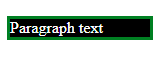
Color
The color CSS property changes text color. You can prefix it with border- or background- to style the respective parts of the element:
p {
  color: white;
  background-color: black;
  border-color: green;

  /* Additional styles needed for border */
  border-style: solid;
  border-width: 3px;
}
Here's what it looks like 👇
Width and Height
You can specify the element size by changing the width and height CSS properties. It's common to use absolute pixel values or percentages, but other units are also available:
.full {
  width: 100%; /* Fills the space horizontally */
}

.fixed-height {
  height: 200px; /* Fixed 200px vertical size */
}
Padding and Margin
Blank space inside of the element is called padding and outside of the element is the margin. Here's how to add spacing to HTML elements:
.section {
  padding: 20px; /* Empty space inside of the element on all sides */
  margin: 10px /* Empty space outside of the element on all sides */;
}
You can control where to add white space by appending -top, -left, -right or -bottom:
.box {
  padding-left: 10%;
  margin-bottom: 20px;
}
Border
Border requires three properties width, style and color, but you can use the shorthand which I recommend:
.box {
  border: 1px solid black; /* width style color */
}
Like with margin and padding, you can append -top, -left, -right or -bottom to specify where to add the border.
Display
If you want to remove the element from the screen, a common way to do it is by setting display: none;
You will also need to set display: flex; when you want to use the flexbox model.
Other common options for display include inline (default for elements like <span>, <b>, <i>) and block (default for <div> , <p> and most others).
Flexbox
The element enters the flexbox mode when you set display: flex;
The most commonly used flexbox properties are:
flex- to control what the element should do with available free space.flex-direction- to control the auto-layout direction.justify-content- to control how elements are aligned on the axis parallel to the flex-direction.align-items- to control how elements are aligned on the axis perpendicular to the flex-direction.
If you're using Figma, flexbox is similar to auto-layout. It's an incredibly useful tool in modern web development that makes creating layouts quick and simple.
Here's a great visual guide by @NikkiSiapno and @ChrisStaud (they make awesome visual explanations of programming concepts). Click the image to download it for free.
Font
The most common font properties you'll use are:
font-size- to change the size of the font.font-family- to change the font itself.
Additionally, you will sometimes want to use line-height which essentially lets you increase of decrease the space between lines of text.
Here's what they might look like:
body {
  font-size: 12px;
  line-height: 20px;
  font-family: "Gill Sans", Arial, sans-serif; /* Ordered by preferrence */
}
Position
There are three values you'll be most commonly using for position property:
relative- the container element for itsabsolutepositioned children.absolute- overlays the element on top of other content at the coordinates inside therelativeparent.fixed- same as absolute, except coordinates are relative to the browser's viewport.
You can specify the coordinates of the element using top, left, right and bottom properties:
.parent {
  position: relative; /* Container for absolute children */
}

.child {
  position: absolute; /* Relative to .parent */

  /* Coordinates inside .parent */
  top: 50%;
  bottom: 0px;
  left: 20px;
  right: 20px;
}

.overlay {
  position: fixed; /* Relative to the browser window */
  top: 100%;
}
Z Index
CSS z-index is used to control which elements will be on top when they overlap other elements. A higher number means higher priority. Usually, it's used on absolute or fixed positioned elements:
.absolute-element {
  z-index: 10;
}
Overflow
The overflow property controls how an element's contents should behave when they don't fit into its box anymore.
Most commonly, you will want to set overflow: auto; to show the scrollbars. However, you also have the option to clip the content using overflow: hidden; which can be useful if you want to show an ellipsis for instance.
.clipped-container {
  overflow: hidden; /* Will hide content that doesn't fit */
}

/* You can control the vertical and horizontal overflows individually */
.scrollbar-container {
  overflow-y: auto; /* Will only show vertical scrollbar */
  overflow-x: hidden; /* Prevents horizontal scrolling */
}
Box Sizing
The box-sizing property controls what width and height mean - the content size or the box size.
To save yourself frustration, I recommend just setting border-box on all elements (instead of the default content-box), because it's more intuitive to work with:
* {
  box-sizing: border-box;
}
In the long term, it's important to understand the CSS box model, so here's a great brief explanation by @ishratUmar18 on Twitter:
Conclusion
Even though there are hundreds of available CSS properties, you will rarely use most of them. This guide covered the ones necessary to start building something.
That being said, there is still a lot to learn if you want to create amazing-looking websites. I haven't touched upon media queries or CSS grid. You should learn them next. However, this guide should be enough to get you started building your first app.
Now, go start building something!
This article is a re-post from my web development blog at codefrontend.com where I regularly post quick guides, tips, and deep dives into various topics of web development.